Typography is a crucial aspect of web design, affecting not only the aesthetic appeal of a website but also its usability and readability. The right choices in typography can enhance a visitor's experience by making text easy to read and by guiding their attention to important elements.
Readability and Legibility
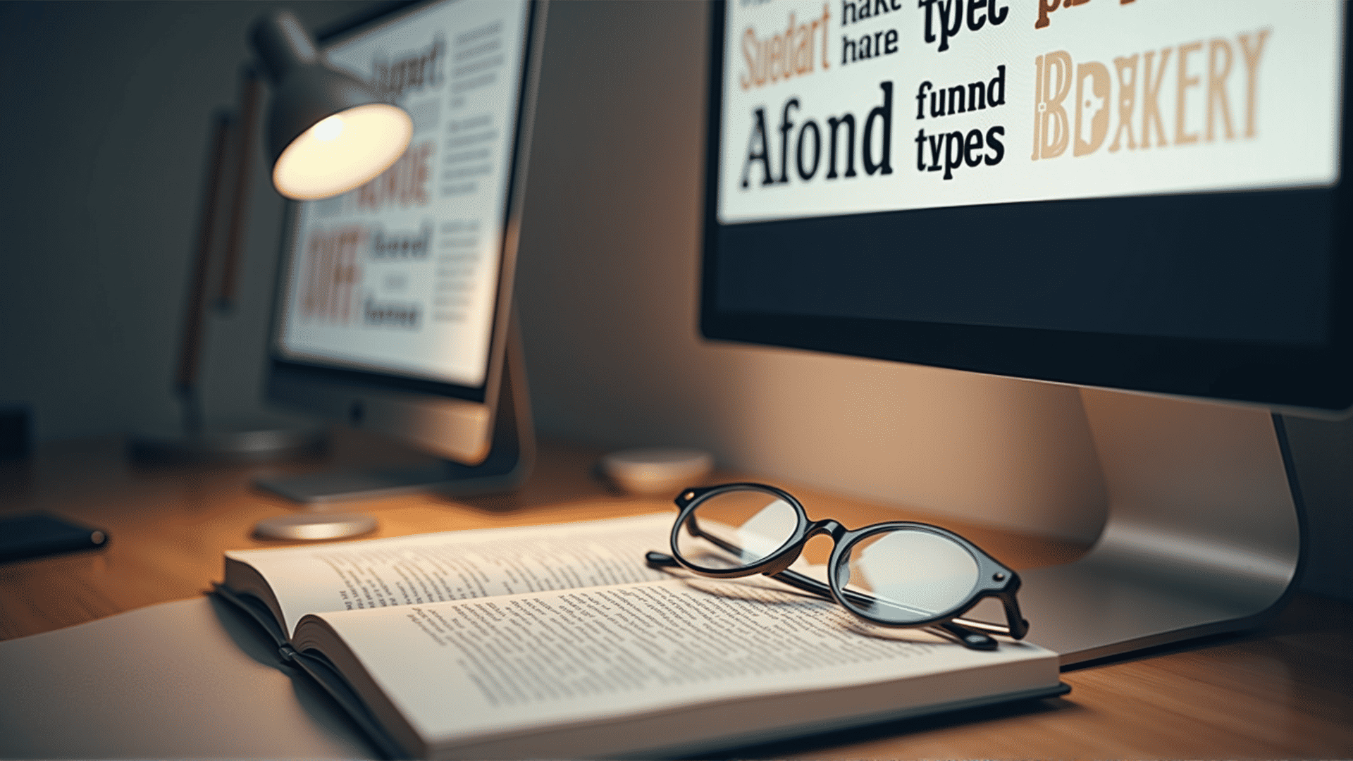
At the heart of effective typography is the concept of readability. This refers to how easily text can be read and comprehended. Choosing the right typeface plays a big role. Serif fonts, like Times New Roman or Georgia, often improve readability in print because the small lines at the end of each character guide the eye along the text. Sans-serif fonts, like Arial or Helvetica, are generally considered more modern and are frequently used on digital platforms to provide a clean and straightforward reading experience.
Hierarchy and Structure
Typography can be used to create a visual hierarchy, making it clear to readers which parts of the content are most important. Headers, for instance, are commonly styled differently from body text, often being larger or bold. This difference in styling helps readers scan a page quickly, efficiently guiding them to the information they need.
Consistency and Cohesion
Maintaining consistency in typography builds trust and establishes brand identity. Websites should employ a limited range of typefaces complemented by different styles and weights to keep the appearance unified while providing visual interest. Consistency helps convey professionalism and assures users that they are still navigating within the same site.
Aesthetics and Emotion
Typeface selection also has an aesthetic impact, evoking particular emotions or reinforcing a brand's identity. For example, a playful, rounded typeface might communicate a sense of fun and creativity, while a traditional serif font can suggest a more formal or trustworthy tone. It is important to align the typeface with the message and personality of the brand.
Responsive Design
With the diversity of devices used to access the web, ensuring that typography is responsive is essential. Great typography adapts to different screen sizes, ensuring that text is legible and visually appealing on both large and small devices. This can involve adjusting type size, line heights, and margins, ensuring a user-friendly experience across all devices.
Conclusion
Typography is not merely about making text look appealing but is a powerful tool for improving the functionality and user experience of a website. By carefully selecting typefaces, establishing clear hierarchies, maintaining consistency, and ensuring responsiveness, designers can create websites that are both beautiful and effective. Through thoughtful typography choices, a website can effectively communicate its message, connect with its audience, and achieve its goals.